

How to tackle a North Facing Room
- laurenamay

- Apr 18, 2023
- 5 min read
North facing rooms can often be a tricky room to decorate because they don't get much natural light. But that doesn't mean that they shouldn't be beautiful too. It just means it takes a bit more effort to get it right. When you know what you are working with and have some valuable tips and tricks I'll share here, it should feel a lot easier.
Firstly, if you aren't sure which way your room faces, then get your smart phone out and search for the compass app. As you load this and point it towards where the light comes from (towards the window) this will help you see which direction your room faces. If you have dual aspect windows then plump for pointing it somewhere in between the two windows.
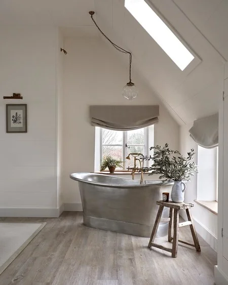
In the northern hemisphere, north facing rooms tent to have a cooler light. This can lead to rooms painted in certain colours to feel cold and stark. If you are using a lighter tone then it is best to avoid any paint colour with a green or grey base.
We have done this with our kitchen which is North East facing so gets a small amount of direct sunlight first thing in the morning, but after that, no natural sunlight at all. We have countered this by having large bi fold doors along the back of the kitchen out into the garden and two velux windows in the roof to allow as much light in as possible. We have painted the walls in Pointing which is a lovely warm but fresh white with our bold accent colour of St Giles blue (archive colour) to add a cheery pop of colour and some fun to the space.
Yellow based neutrals like F&B's White Tie, New White and Wimborne White give a warmth off when used so this can be used to balance out any cold from the north natural light.


All Images above are Wimborne White from Farrow and Ball's website.
Here are some key points to consider...
Avoid 'cool' colours likes blues and greys as they will feel colder.
Avoid colours that have a blue, grey or green base – some paint charts will give you more information on base colours. Alternatively call into a paint showroom and ask an expert.
Go for colours with yellow or red in its base to make it feel warmer like Pointing, Dimity, and Joa's White.
Resist painting a small North facing room in brilliant white, as this will give a harsh clinical and cold feel to it. The undertones are usually grey/ blue so this won't help combat your cold feeling.
My best recommendation for paint to use is Farrow and Ball. The light reflecting ingredients give a wonderfully warm and embracing feel which looks different in multiple lights and a different times of the day which gives it a brilliant opulent feel. The Dead Flat and Modern Emulsion finishes are also wonderfully hardwearing especially if you have kids, pets or both.
Remember, you can still warm up the room with furniture and accessories, so put thought and effort in to choosing these too with the same colour principles.
There are two main ways to tackle a dark north facing room. Attempt to brighten it, or ...
Embrace the darkness! Make it a cosy dark and dramatic room.
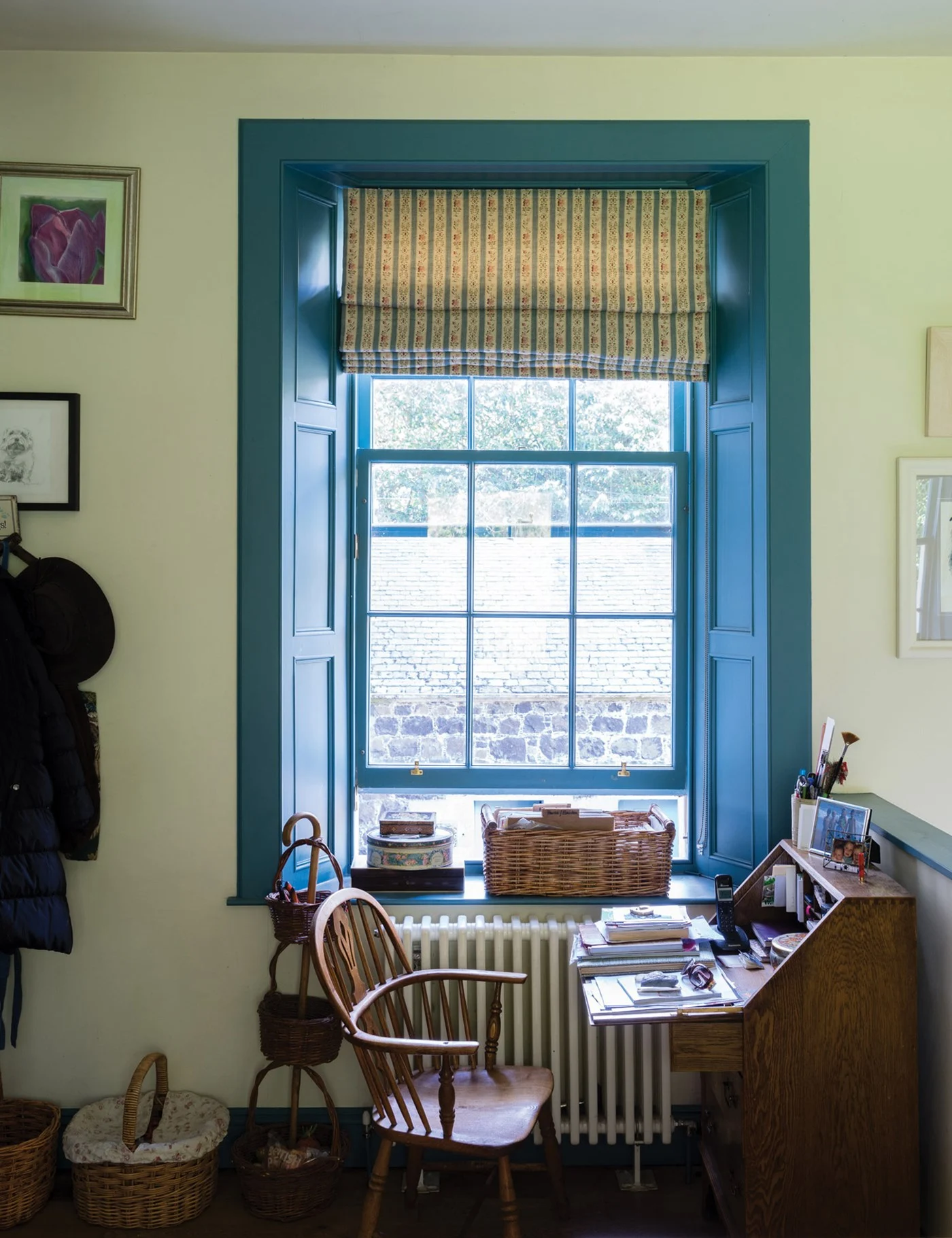
Think about your windows. Make sure the fabric you use around the light is coherent with your look. If you are having blinds, can you have them above the window so not to block any light out? If you have curtains can you draw them all the way back out of the window to allow as much light as you can in to the space.
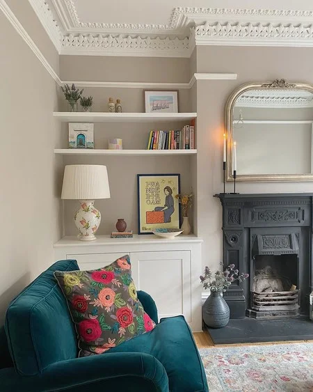
The orientation of the rooms can make a huge difference to paint colour. I have had clients who have used the same paint, let's say for example Farrow and Ball's Elephant's Breath and had very different results. This is fine as long as its a result you are expecting and have tested properly!
This colour is extremely complex which is probably why it is quite so popular (aside from the name as a great dinner party talking point) It's lilac undertones mean that in some cooler lights it can look almost grey/purple but in lighter rooms it can be a soft warm taupe. It is part of the contemporary neutrals collection and brings an edge to the room it is used in. I love the versatility of it and how it adapts so beautifully to each room it is used in. It gives a bespoke look so no same room will look the same when used with this colour.


All images above are Elephant's Breath from Farrow and Ball's website.
Sample Pots and how to use them...
This means it is even more crucial when choosing a paint colour, that you test it correctly. Buy a sample pot of the colours you are trying and paint them on a large piece of lining paper or the back of some unwanted wallpaper. You will get 1 meter sq coverage from a 100ml Farrow and Ball tester pot so use it all and not just a small patch. Do two coats do you get a good idea of the true colour and put it up on the wall. Don't put it next to other colours, because your mind will become confused by looking at multiple colours at once. The colours will also react differently to the colours around them. So if its not part of the finished look, get rid of it, otherwise this will impact your colour. Look at it separately, on its own on the wall, and move it round the room so you can see it in different lights at different times of the day and when you have natural light and artificial light affecting the colour.
Top Tip
Remember to use mirrors in your room too to reflect light around the room. Having a large mirror close to your natural light source will help lift the room too.
Embracing the Darkness
Finally another approach is to not fight the north facing element of your room but to embrace it. This can be done by using colours such as Railings or Down Pipe. Remember these colours don't have to be used all over, and can be used in conjunction with another colour.


Left to Right Down Pipe, Railings and New White combined with Stone Blue. All images from Farrow and Ball's Website.
Final Note
All Farrow and Ball colours come with a complimentary colour that is a white or a neutral and an accent colour. This means that the bases of those colours all work in harmony together as they are from similar 'families' with complimenting bases.
Case Study
For example, take Dimity, (a lovely warm neutral) It's complimentary colours are Pointing (a shade lighter in the same family) Joa's White (a shade darker in the same family) and an accent colour of Tanners Brown (a lovely chocolatey brown) The accent colour is to be used in small doses and it compliments the rest of the palate. It cane be used as a lampshade, picture frame, cushion etc, it doesn't have to be paint. Dimity's complimentary white is Pointing as previously mentioned. Pop into your nearest Farrow and Ball showroom for expert help (or ask me!)
Bye for now...
If you want to inject some love and new life into any of your rooms in your home, then get in touch and we can work on that together.
My interior design services can turn your home from a boring and unloved space to an uplifting, fun and sociable place to be. With services ranging from £225 to £395 depending on your needs, or a bespoke quote, I can help you transform your home.
Get in touch 👇🏻
📧 hello@laurenmayinteriors.com
📞 07712185467
💻 www.laurenmayinteriors.com
Some Kind Words from a recent Client
'Before using Lauren's services, I didn't even want to sit in my living room and we put the house up for sale. After using Lauren's Interior Design Service, I love using our living room now, and we have even taken the house off the market!' Sarah E
Lauren X


Comments